
Hublot Big Bang Unico Essential Grey And The Strength Of A Single Colour
Grey can be a surprisingly demanding colour for a complicated sports watch. It removes the usual visual shortcuts: a bright bezel, a contrasting strap or a loud accent on the subdials. The Hublot Big Bang Unico Essential Grey is interesting precisely because the watchmaker asks one tonal family to carry almost the entire design. The result depends on the transition between brushed metal, polished edges and the dark openings of the dial, not on an easy contrast between black and gold.
The Essential Grey version belongs to Hublot’s broader Big Bang Unico family, with its substantial case, exposed chronograph architecture and prominent bezel screws. For readers of our UK replica watch editorial, the point is not whether a grey dial is fashionable in a particular season. It is whether the structure of this very recognisable watch remains clear when most of its components share nearly the same colour. A good photograph of the face should allow the eye to separate the hour markers, hands, chronograph indications and framework beneath them.

On the original Essential Grey, titanium gives the case a lighter material character than its large dimensions might suggest. Satin brushing changes appearance as the wrist turns, while polished boundaries stop the case from looking like a single slab. In photographs of imitation or replica interpretations, these changes in surface are among the first things worth inspecting. A case can have the right silhouette and still look flat when the transitions between finishes are missing.
The bezel is particularly revealing. Its circular opening sits inside a faceted case, and the screws punctuate the edge without making it look completely symmetrical. Look at the thickness of the bezel ring relative to the visible dial, then compare the spacing of the hour indexes. Neither measurement should be judged from a single tilted sales picture. A straight-on view and an oblique view answer different questions about proportion.
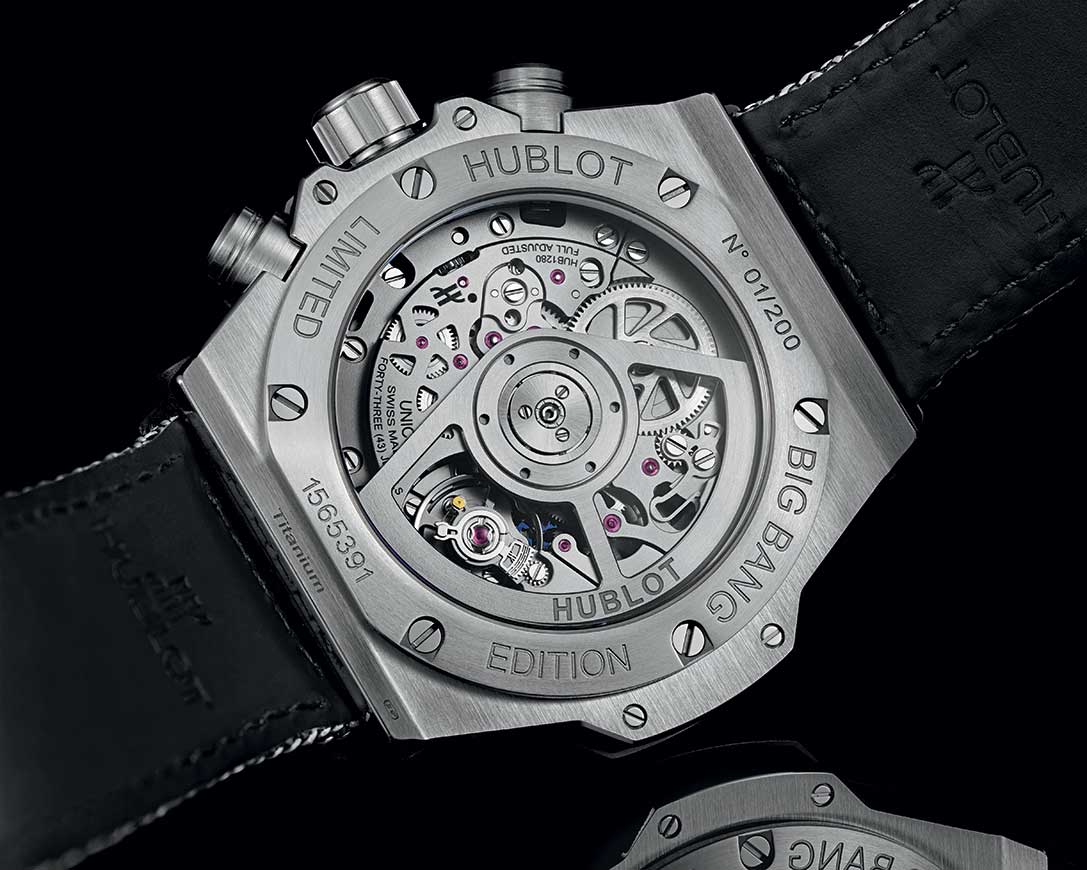
The openworked dial creates a second challenge. The Unico chronograph was designed to make some of its mechanical architecture part of the watch’s visual identity. That does not mean every dark shape behind a skeletonised dial is evidence of a particular movement. With a replica, the decorative bridge layout and the actual movement below it can be different. The sensible distinction is between dial-level visual resemblance and verifiable movement architecture; one should never be used as proof of the other.
What the Essential Grey reveals about the Big Bang design
Placed beside a more expressive Big Bang variant, Essential Grey shows how much personality comes from the case itself. Hublot’s Gourmet edition, for example, puts emphasis on patterned metal rather than uniform colour. The photograph below is from that separate model and serves only as a contrast in surface treatment, not as an image of an Essential Grey reference.

The comparison explains why the same design language can feel restrained in one edition and deliberately theatrical in another. Essential Grey still has a busy dial and a strong wrist presence; the monochrome treatment simply makes those elements compete less aggressively. Readers interested in how that vocabulary develops can continue through our Hublot model and replica design archive, where the Square Bang and Classic Fusion take rather different approaches to case shape.
What matters most here is not an unsupported promise of a perfect copy. It is the relationship between the grey case, the open dial and the chronograph’s geometry. When assessing photographs, begin with those relationships. Colour accuracy alone tells very little about whether the whole watch has been understood.